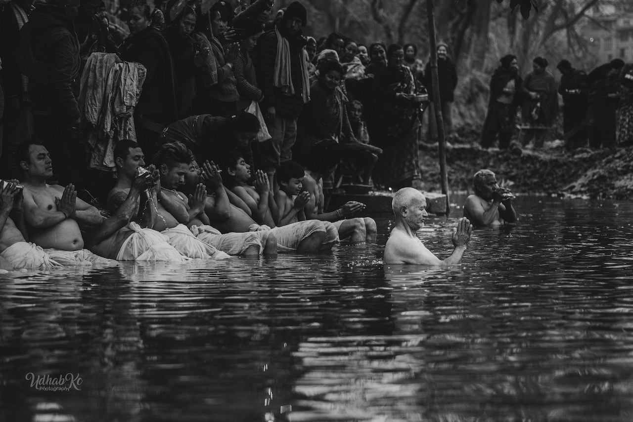
Colour vs Monochrome
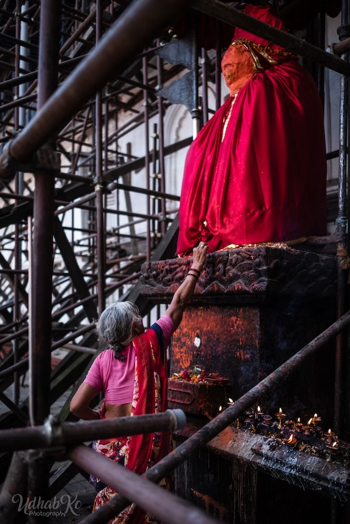
I used to shoot almost everything in black and white. It felt timeless, honest, and free of distraction. But over the years, I began to notice that some frames lost something essential when the colour was taken away — a red door in Patan, the particular gold of evening dust in the Terai, the way a blue plastic chair in Asan becomes an anchor for the whole composition.
This isn't a technical guide. It's a series of thoughts on how to choose — and when not to.
The Black & White Reflex
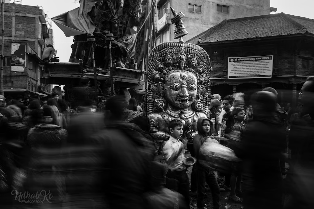
Many street photographers begin with black and white. It simplifies the frame. It removes the distraction of competing colours and lets us focus on gesture, light, and geometry. Henri Cartier‑Bresson, Daidō Moriyama, Sebastião Salgado — they all built their visual language in monochrome.
But reflex is not the same as intention. If you shoot black and white because you've never questioned it, you might be hiding from colour rather than embracing a choice.
Ask yourself: Am I using monochrome to strengthen the image, or to avoid dealing with colour relationships?
What Colour Can Do That Black & White Cannot
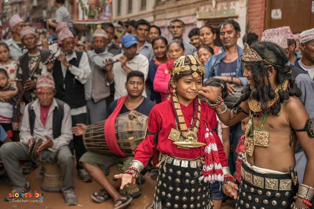
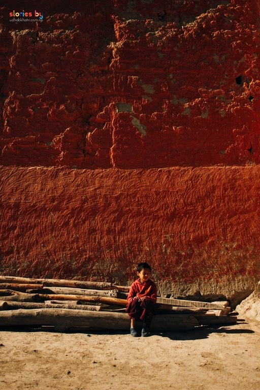
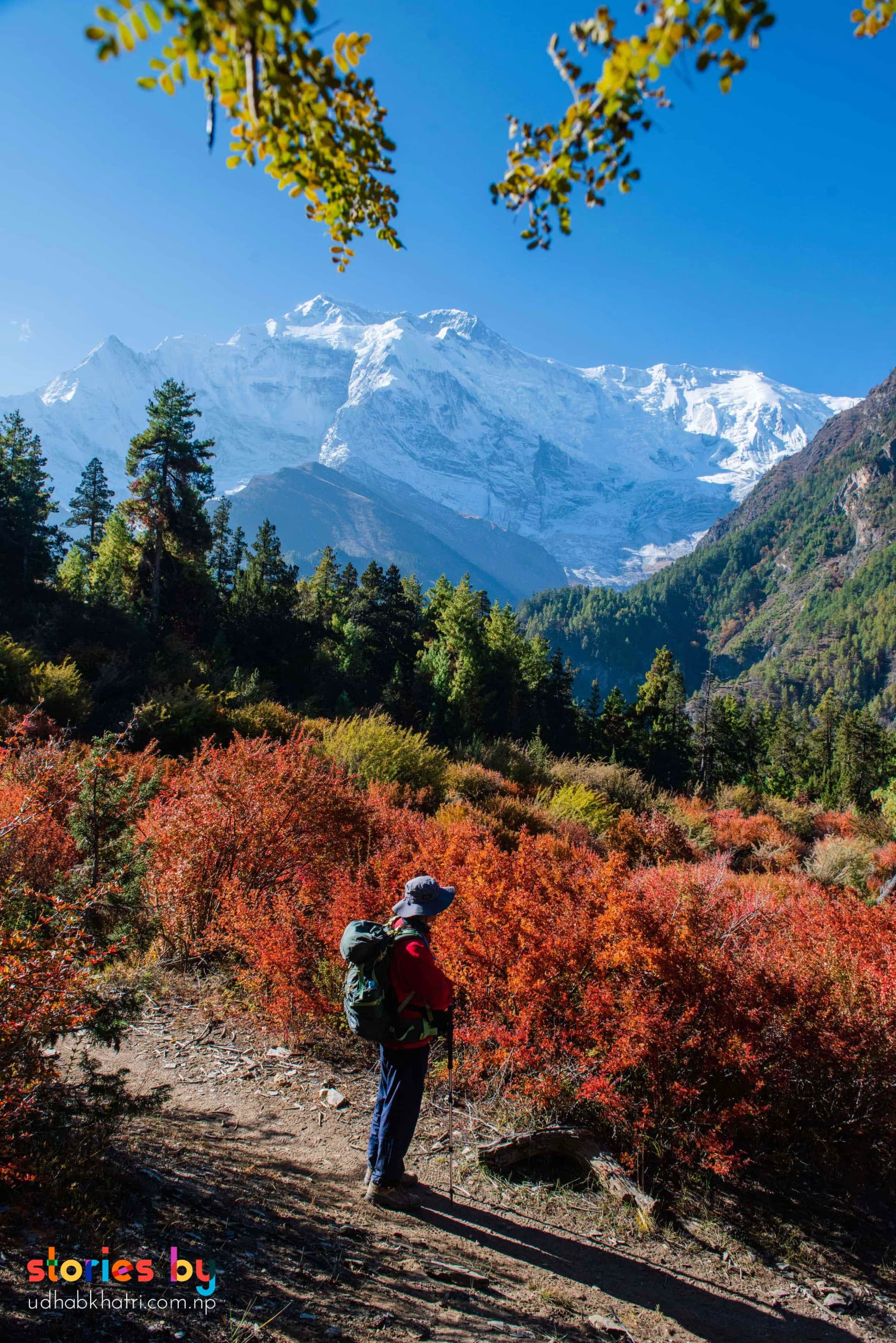
Colour is information. It tells you about a place, a culture, a time of day, a mood. The ochre walls of Bhaktapur, the faded green shutters in Boudhanath, the synthetic pinks of a Kathmandu festival — these are not distractions, they are characters.
Colour can:
- Ground an image in a specific place and moment
- Create emotional temperature — warm, cold, nostalgic, tense
- Organise the frame when tones are too similar
- Draw the eye to a subject without relying on light alone
When Monochrome Is the Stronger Choice
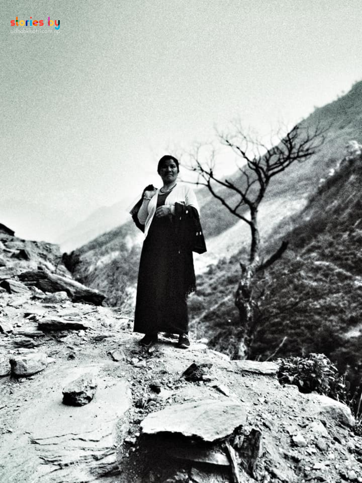
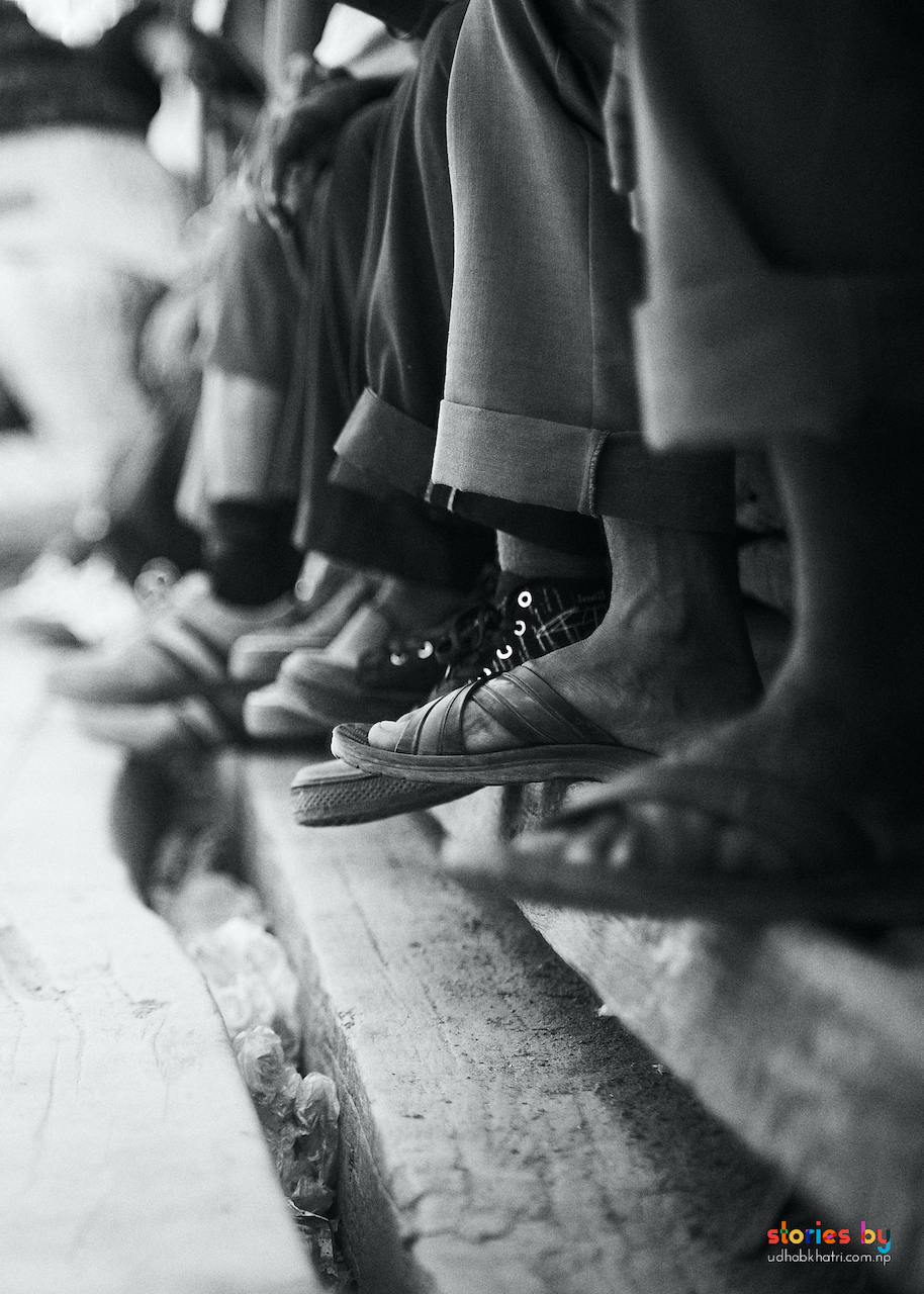
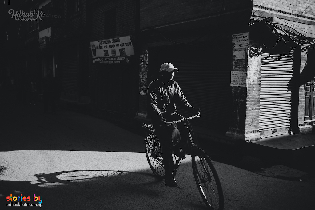
Monochrome works best when the frame is already strong — when the geometry, light, and gesture don't need colour to carry meaning. It's also a powerful tool when colour is actually a problem: clashing tones, harsh mixed lighting, or backgrounds that pull attention away from the subject.
I often switch to black and white when:
- The story is about shape, not place
- Light is the main subject
- The colour palette of the scene is confusing or ugly
- I want the image to feel universal, not location‑specific

Training Your Eye for Colour
Seeing colour is a skill. Start by noticing how colours sit next to each other on the street: a red sign against a yellow wall, a blue jacket in a sea of browns, the way skin tones shift under different light sources.
A small exercise: pick one colour before you go out — say, red. Look for it. Photograph it in different contexts. Notice how it changes the mood of the frame depending on what surrounds it. This practice gradually rewires how you see.
The Grey Area (Literally)
You don't have to choose forever. Some photographers work in colour for years, then switch. Others edit the same frame both ways and sit with the difference. The point isn't to be a "colour photographer" or a "black & white photographer" — it's to make the right decision for each image.
I mostly shoot black and white. But it's a decision, not a default.

A Final Thought
If you're unsure, shoot in colour. You can always convert a colour image to black and white later, but you can never bring colour back to a monochrome file. And sometimes, the photograph you thought was about shape and light is actually about the red plastic stool you almost ignored.
Don't let habit decide. Let the street decide.